Menin 80 Years Port
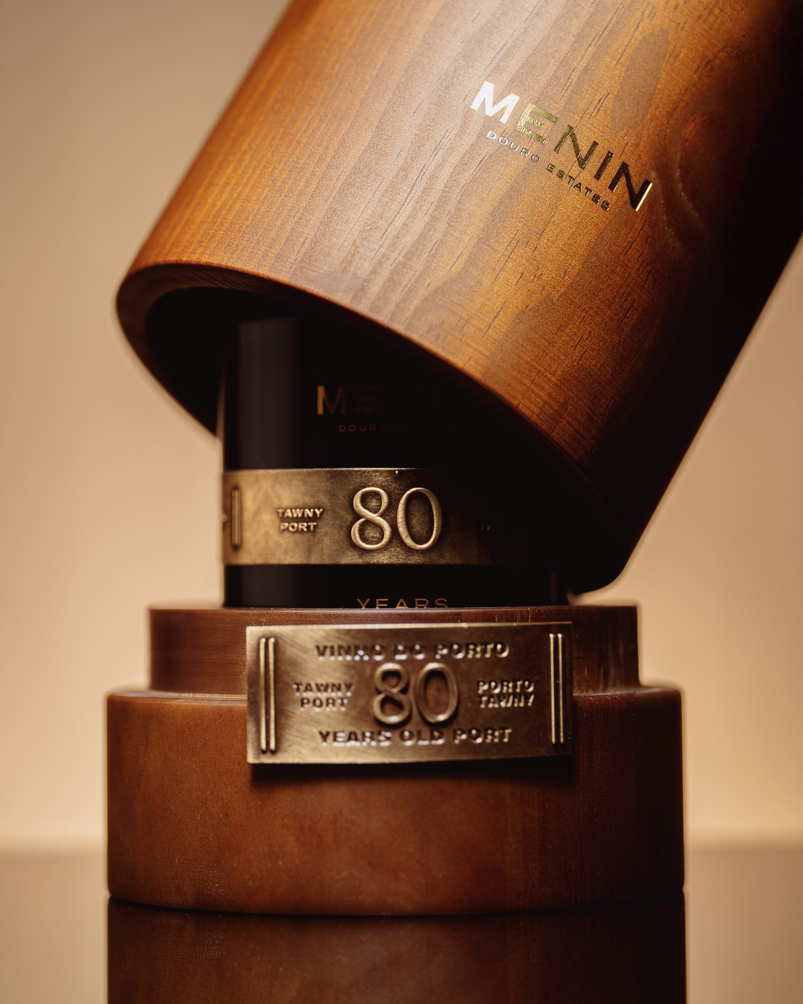
Label Design and Packaging
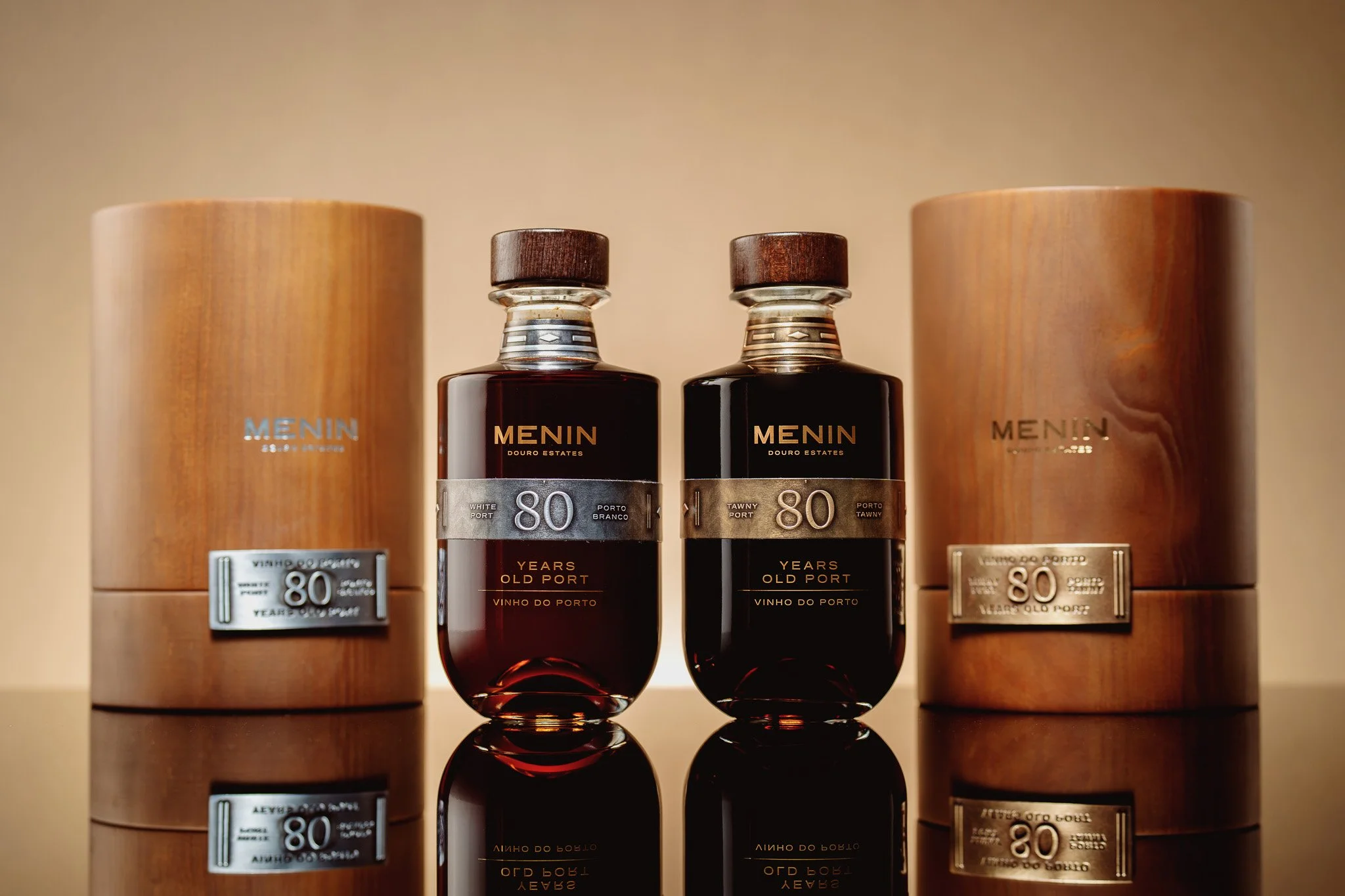
The project’s robustness begins with color. Gold for the Tawny and silver for the White are more than chromatic decisions; they are material metaphors. Gold conveys depth, age and warmth, while silver expresses freshness, clarity and a certain ethereal character. Both finishes are applied with durability in mind, giving the bottles a sense of permanence worthy of their age.
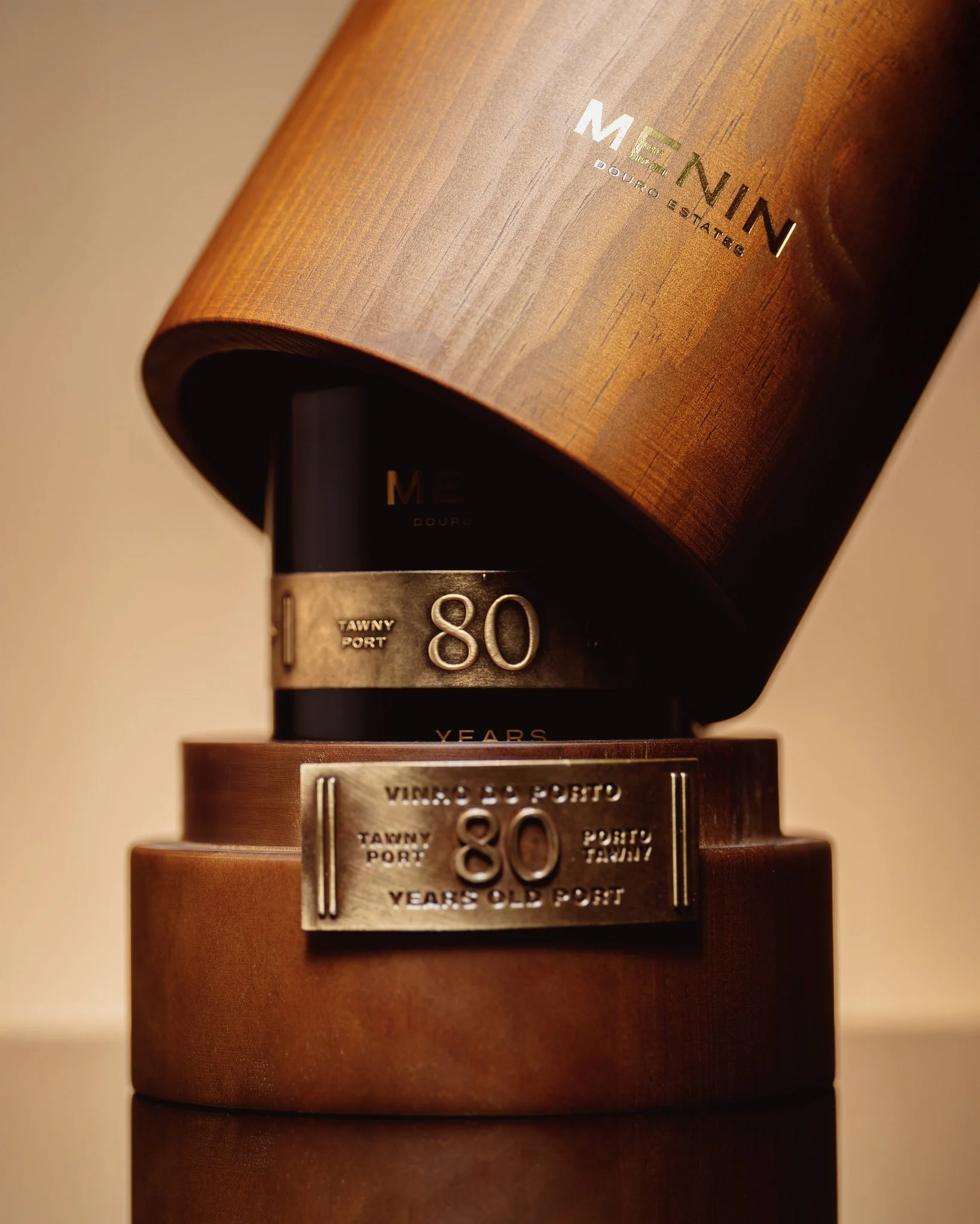

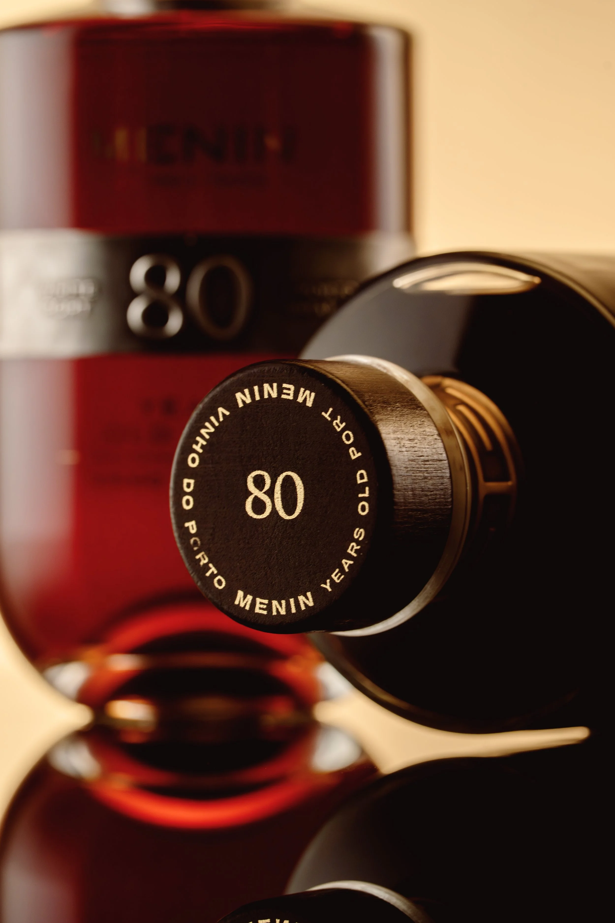
The visual system was built with the discipline of watchmaking. Balanced lines, careful spacing, and decisions driven by a single question: how do you express eight decades in a graphic object? The answer lies in restraint. In respect for material. In elegance shaped by what is left out rather than added.
The winemaking context strengthens the design’s purpose. Menin Douro Estates selected lots over eight decades old, creating a Tawny and a White that are pieces of Douro heritage. Design’s role is not to overshadow this story, but to elevate it. The metal-clad, sealed bottle and wooden case become contemplative objects, while the label crafted by Bisarro Studio connects tradition, longevity and contemporary precision.

