Menin
Label Design and Packaging
Fotos: Bleam
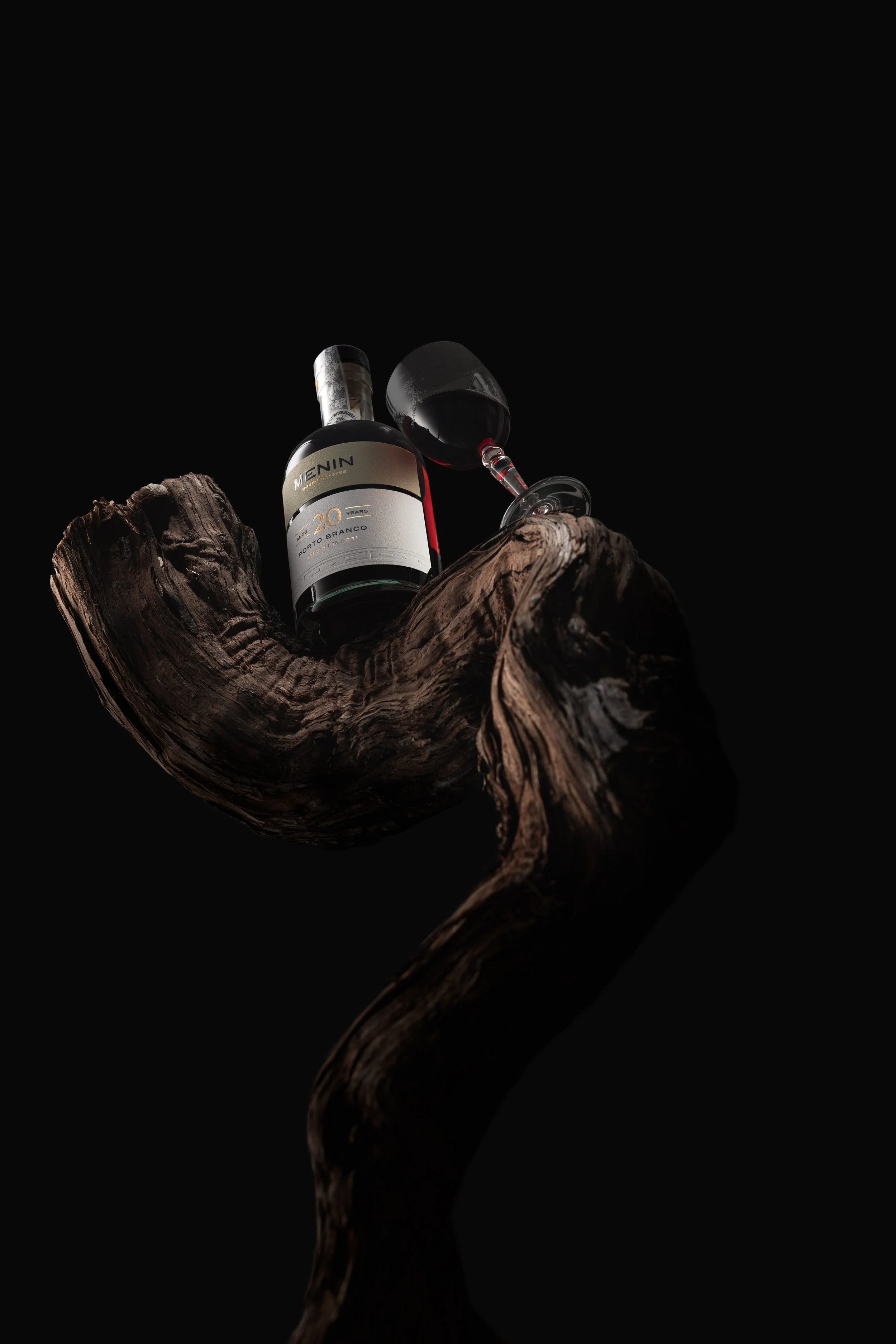
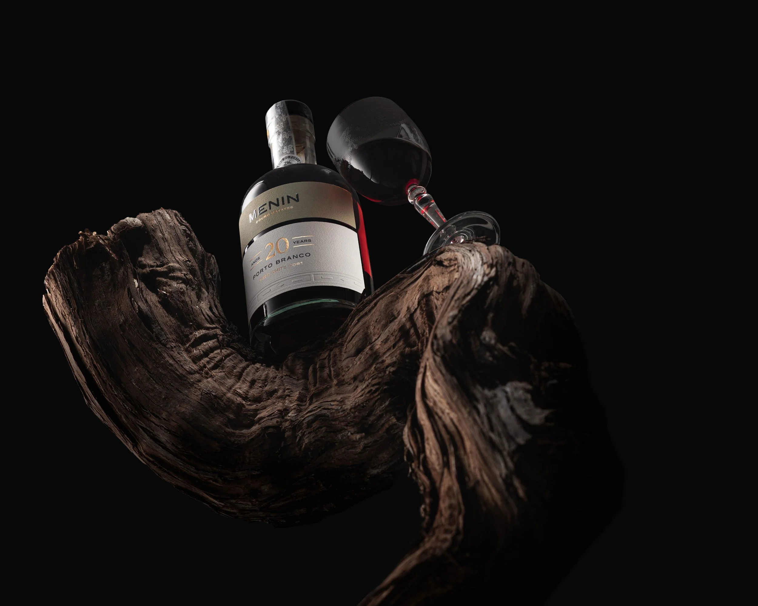
In a valley carved by centuries, where terraces meet the sky and time ferments slowly under the sun, MENIN Douro Estates honours the weight of legacy with the elegance of precision. For its collection of aged Ports — in Tawny and White, from 10 to 50 years — the brand invited Bisarro Studio to design a label system that could echo the quiet intensity of the wines themselves.
The system unfolds in two forms: a rectangular label, more traditional, for younger Ports; and a triangular label, more refined and unexpected, for older wines — a quiet gesture of boldness and vertical elegance that reflects the maturity within.


Around it, Bisarro built a material narrative where design gives space to wine. Texture speaks. Light catches on hot gold foil, the name MENIN embossed with the calm certainty of something that doesn’t need to prove itself. The paper — tactile, raw — begins in white and warms, bottle by bottle, to hues of khaki, bordeaux, and brown, mirroring the colour journey of the wine within. Age leaves its mark — and it’s beautiful.
Each element is intentional: the clarity of transparent glass, the restraint in typography, the subtle shimmer of metallic detail. It’s a label that doesn’t demand attention, but rewards it. A design you feel before you understand. Like the Douro itself — steady, timeless, and quietly immense.


This is not a story told loudly. It’s one revealed slowly, as the bottle opens, as the wine breathes, as the years unfold. A visual whisper of where the wine has been — and a confident suggestion of where it’s going.